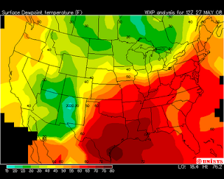
 This is an Isoline map because it shows areas that have temperature. The map creates regions of common temperature which are fundamental in isoline maps.
christal map catalog
Thursday, March 24, 2011
Isoline maps
 This is an Isoline map because it shows areas that have temperature. The map creates regions of common temperature which are fundamental in isoline maps.
Proportional circle maps
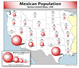 This is a Proportional circle map of Mexican population in the west. The larger the circle, the larger the population is in that state.
http://www.neiu.edu/~jrthomas/377/circle.jpg
Thursday, February 24, 2011
Choropleth maps
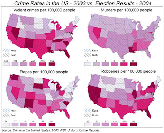
http://www.geog.ucsb.edu/~jeff/gis/choropleth_maps_files/election04_vs_crime03b.jpg This is a Choropleth map because it shows the election results and crime. This Choropleth map shows data that allows the reader to understand elections and crime.
Dot distribution maps
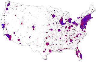
http://www.stat.columbia.edu/~cook/movabletype/mlm/votemap.jpg This map use dots to show the distribution of voting by counties. The dot size depend on the number of victory and the total number of votes a candidate received.
Propaganda maps
Thursday, February 17, 2011
Hypsometric maps
PLSS
Subscribe to:
Comments (Atom)


